
Duration: 2023 Q1
Produgie is a B2B SaaS platform designed to activate leadership and strengthen teamwork to drive business performance and growth. It equips individuals and teams with assessment analytics to help them understand their strengths, strategies, and areas for development. Alongside these insights, Produgie offers guided activities that encourage users to apply behaviors and achieve outcomes. Our challenge was to design a clear, accessible, and inclusive experience, one that empowers users to confidently take action and see progress.
My Contribution
As a in-house lead UI/UX Designer, I designed strategy and execution from research and information architecture to High-fidelity UI, User testing. I also established the design system and branding for the company.
Team
Traditional coaching is expensive, slow, and often limited to executives. Meanwhile, most employees lack real-time tools and guidance to grow, lead, and perform, especially in hybrid and fast-changing environments.
77%
of organizations report they are currently experiencing a leadership gap.
Source: Brandon Hall Group
The average cost per participant in traditional leadership programs is
$4,000-$10,000
Source: raining Industry Report
87%
of millennials rate “professional growth and development opportunities” as important to them in a job.
Source: Gallup
To achieve meaningful leadership development, building consistent habits is essential. This is where Produgie Sprint comes in, guiding individuals to take action, reflect weekly, and receive feedback to drive real outcomes.
Growth Leader Assessments

Habit Forming Tool “Produgie Sprint”

Individual & Team
Impact Board

Analytical
Dashboard


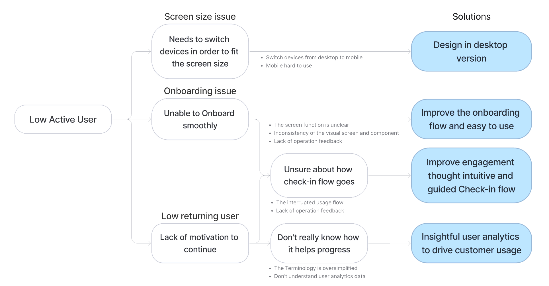
I interviewed 12 users and analyzed their feedback, which allowed me to create a User Journey Map highlighting key problems, user expectations, and the most confusing phases. The main pain points identified include:


The interrupted usage flow
Users don't know what or how to do, or where is the information when onboarding the Sprint and doing weekly check-in.
The screen function is unclear
The repeated UI component and unclear purpose of the button confused them.
Inconsistency of the visual screen and component
The mobile screen is hard to use because the item is so small. The content lacks of priority with misleading colors.
The Terminology is oversimplified
The unknown abbreviation, and small font size are unable to read.
Lack of system operation feedback
User couldn’t find the CTA
No motivation to complete the Sprint
User often missed the check-in date and feel Sprint takes a lot of effort out of their work.
Furthermore, from the backend data and user interviews, we found out that the user doesn’t use the “User Analytics” that should monitor their Sprint progress.
“I am not sure about this data, but I hope it helps my progress”
The assumption is that users don't understand the meaning of user analytics data because it didn't displayed visually and intuitively.
We narrowed down the problem scope by focusing on what causes the worse user experience that leads to the low active user rate, and transformed the problems to design goals.
How Might We...
For Check-in flow, I studied how other platforms and experts lead the conversation to guides others, which would help to design guidances, leading users during their check-in reflections.
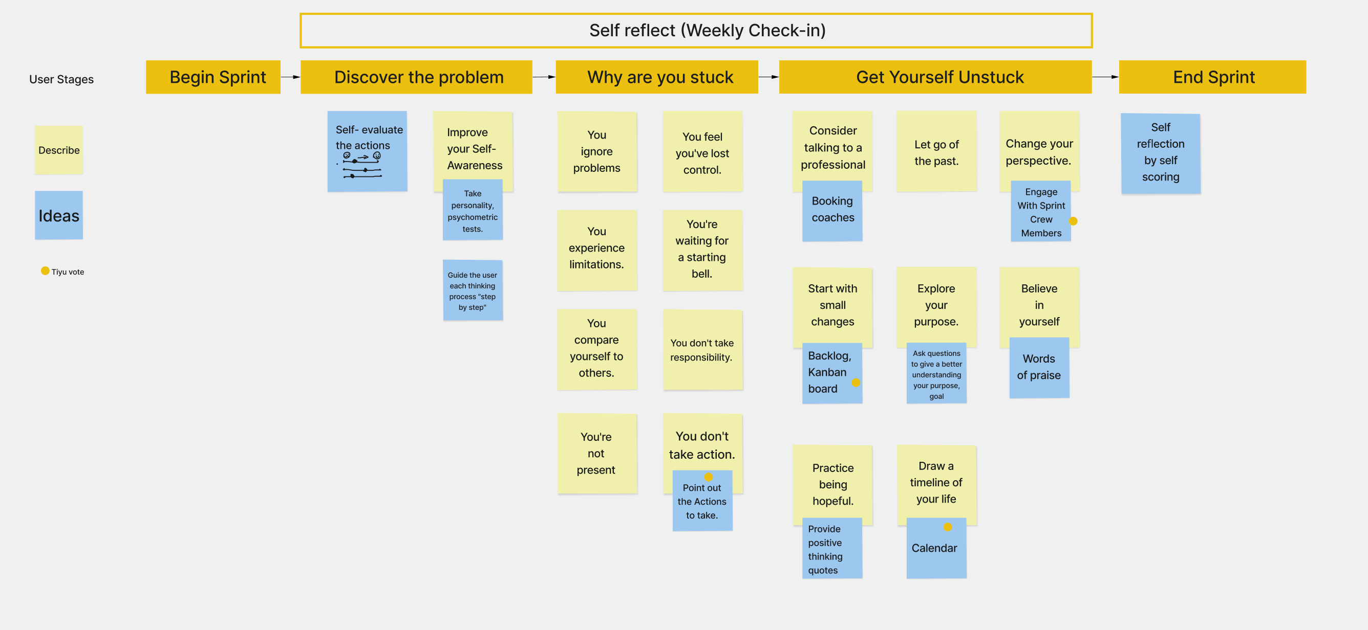
In order to understand how to improve the working outcomes through Produgie Sprints, I interviewed people to understand how they manage working tasks and form daily habits. And incorporating the idea of managing and tracking tasks, as these are common behaviors.
Insights:

Based on our current API, my team and I discovered all possibility to display the analysis graphs, and extract the key useful charts in a workshop.
Questions to help us define and focused on the right data:
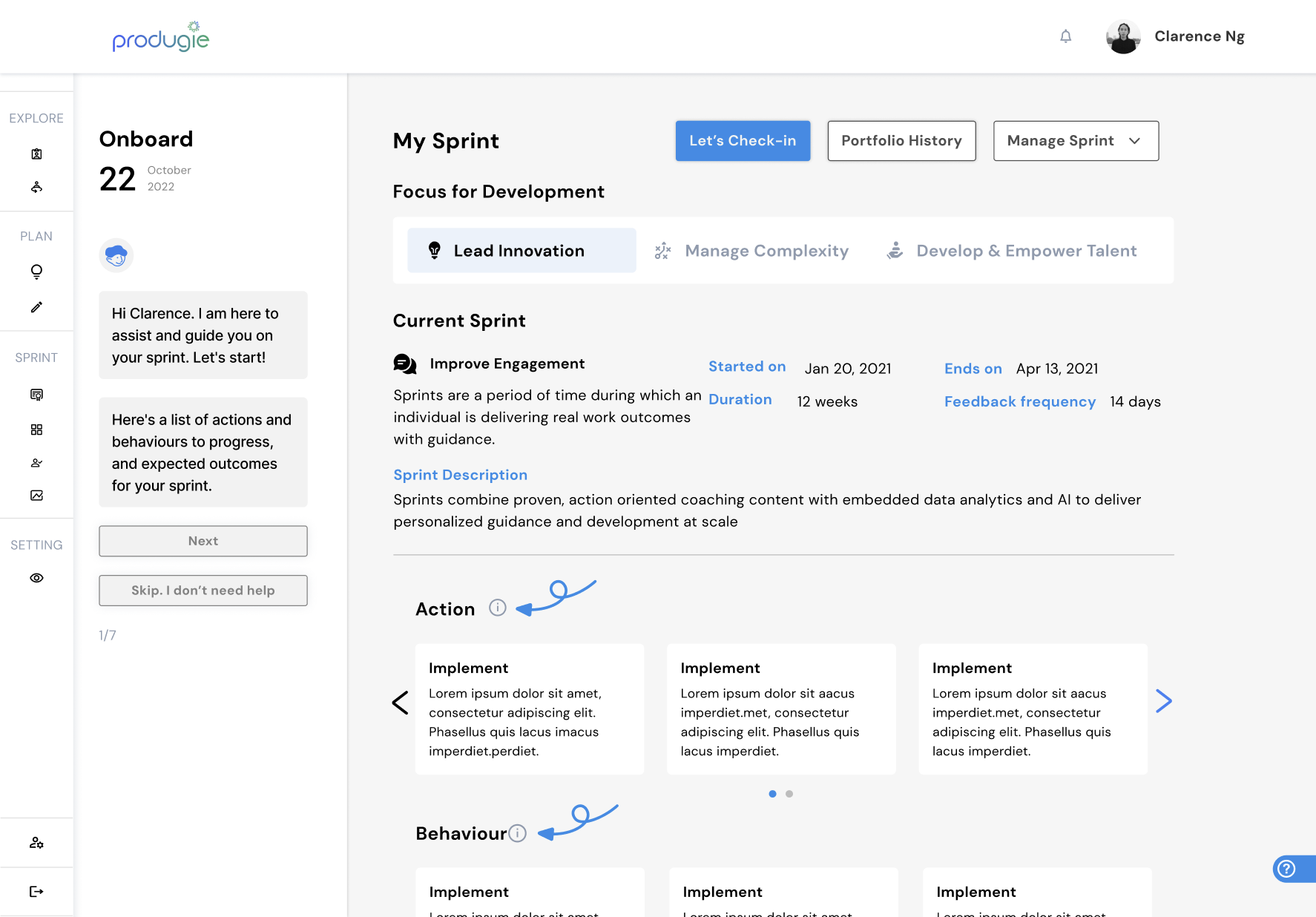
We came out with the ideal Sprint flows that address what users will go through, combination flows of Onboarding, Check-in, Final Review, and Sprint Crew feedback.

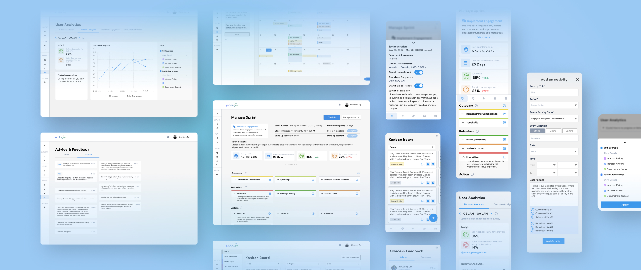
As part of the weekly Check-In reflection process, the Produgie Assistant on the left panel will guide the user through various screens. This will facilitate interaction with the reflection process, allowing the user to view their previous progress, feedback, and planned activities to improve.

I created colors for actions to help recognize and compare multiple activity cards. With the combination of the Sprint practice and working task, the user will be able to track and manage their progress in To-do, In progress, and Done statuses.
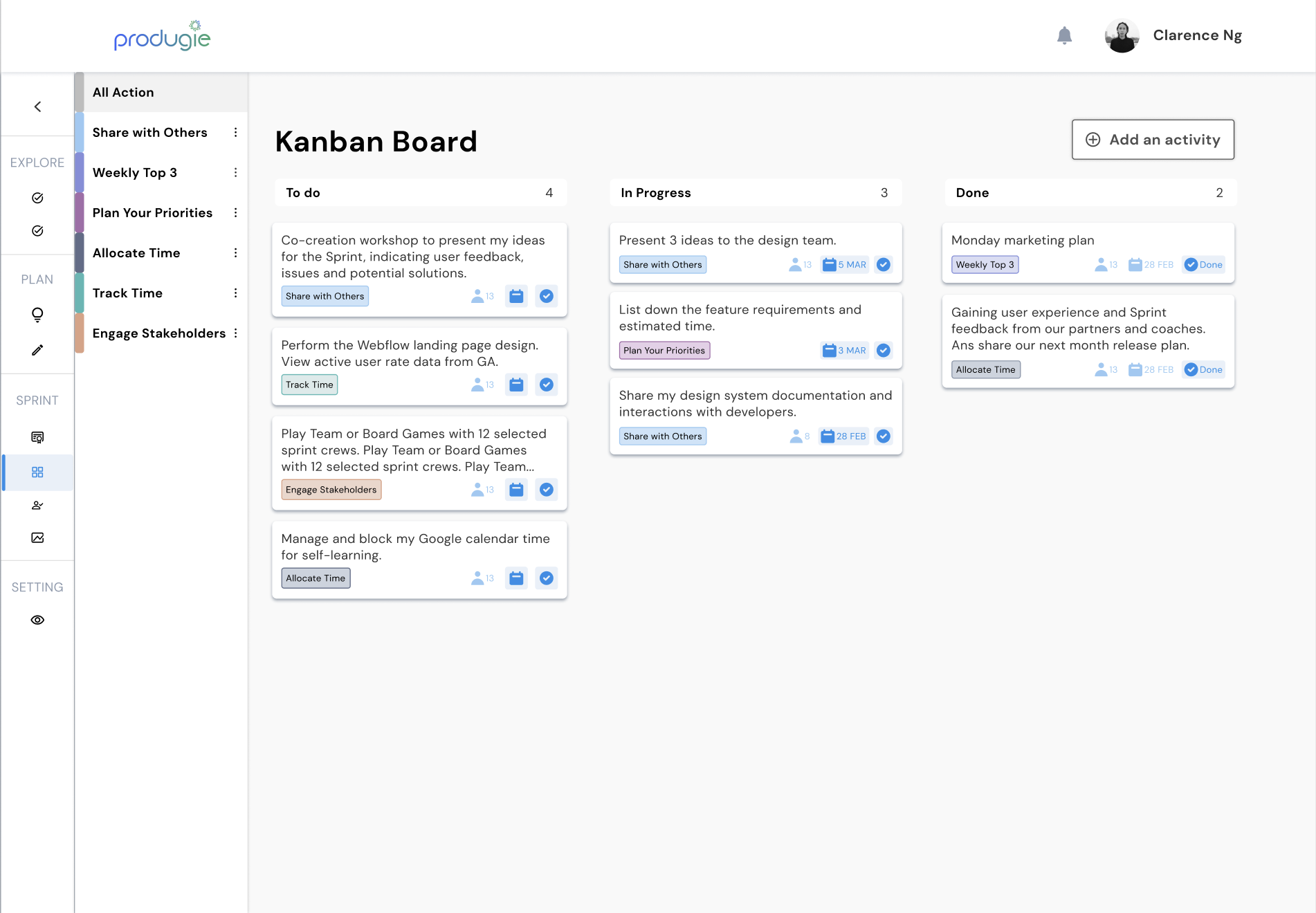

In order to allow the user easy to remind, we created Quick add To-do list for reminding of behaviours and outcomes.

Leading sentences help users understand and reflect on their data. The user can even compare themselves to everyone to see gaps for improvement. (v1)

Prioritize the key information. Insights with the visual color face, progress trend, and suggestions from the data results. (v2)

Result and future enhancement
Walkthrough product demo sessions for our core customers based in the US, Indonesia and Malaysia, and they were impressed with how proactively we are working to improve the User experience.
We receive a lot of praise and impressive from our customers. We have reduced 30% user questions and increased 1K+ user impressions.
Future enhancement:

